Tamatem Launches Rebrand!
We are wrapping up the year with a brand new look! Don’t worry! We’re still the same at heart, but we felt that our company has evolved so much over the years that the time has come for us to create an identity that reflects the tremendous growth we’ve gone through and we’re so excited to share it with you!
Our old brand has served us massively since our establishment in 2013. For eight years it embodied our mission and what we stood for. But a lot of things have happened since then, eight years is a long time and especially in an industry as fast-paced as ours. So we decided to create something that was more with the times, something that illustrates how much we’ve matured while also echoing our unwavering commitment and love for entertaining people with the best ever Arabic mobile games!
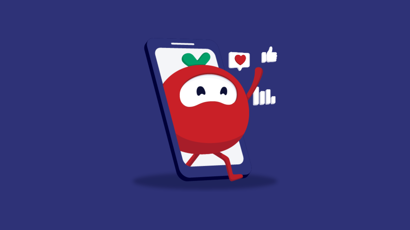
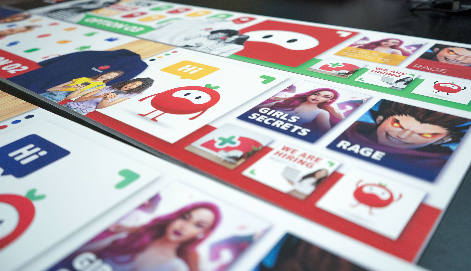
Over the past year, we poured our hearts and souls into building a brand that perfectly depicts who we are. Let’s dive right in and show you the design process we undertook! Our new logo is most definitely still a Tomato! We are Tamatem. The reason behind our symbol and name is that the word ‘Tomato’ is actually the same in a lot of different languages. Tomato, Tomatti, Tomate, and Tamatem all mean the same thing! We felt that having a name that is understood in so many different languages is pivotal in representing our mission and purpose of creating relatable and approachable content no matter the language you speak. The tomato is a perfect depiction in both name and design. Bright, colorful, approachable, and relatable is who we are and what we always will be!
Now that we covered our relatability and approachability by basically being the best fruit this world has to offer. We still felt that our logo needed something more, something that exhibits our unmatched experience and maturity in the gaming industry! This is where the fun part comes in. The most recognized shapes in gaming are the plus sign ‘➕’ and circle ‘⭕’. Whether it’s on a gamepad, a mobile screen, or a dual shock the ➕ and ⭕ are extremely recognizable and easily affiliated with our industry. So in that sense, we used the most noticeable symbols in gaming and merged them together with the colorful, youthful, and approachable tomato to create our new and upgraded identity! Adding a little vibrance to our color pad, boom! The new Tamatem is born and entirely demonstrates our commitment to being the leading mobile game publishers in the region with an unmatched experience and a youthful colorful team that is growing and blossoming every single day!